

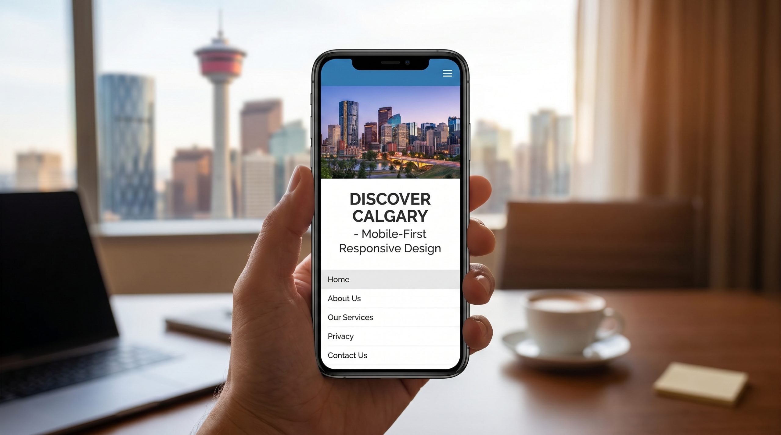
Why Mobile-First Design Matters for Calgary Businesses
Your customers are on their phones. Is your website ready for them?
Calgarians are a mobile-first audience. Whether they’re searching for a downtown lunch spot on the C-Train, looking for an emergency plumber on their commute, or browsing local shops from the couch, most online interactions in our city happen on smartphones. If your website isn’t built for mobile first, you’re invisible to a massive chunk of the market.
Mobile Usage in Calgary: By the Numbers
68%of Calgary web traffic is mobile 4.2savg. mobile attention span 53%of users abandon sites that take >3s to load 76%of Calgarians use mobile for local search
These numbers make one thing crystal clear: if your website delivers a poor mobile experience, you’re leaving money on the table.
5 Key Reasons Mobile-First Design Matters
Google switched to mobile-first indexing years ago, and in 2026 that’s still the standard. Googlebot crawls and indexes your mobile version first. If your mobile site is slow, cluttered, or missing content, your entire Calgary SEO strategy suffers.
Calgary is a driving city with a culture of on-the-go searching. From “best brunch in Kensington” to “tire shops near me,” mobile searches happen constantly. A responsive, fast-loading mobile experience captures that traffic before your competitors do.
Mobile-optimized sites convert at significantly higher rates. Large tap targets, streamlined forms, and thumb-friendly navigation make it easy for visitors to call, book, or buy. A frustrating mobile experience kills conversions.
Calgarians have been trained by apps like Uber, SkipTheDishes, and Instagram to expect seamless mobile experiences. If your site feels “zoomed out” or requires pinching to read text, visitors will bounce — likely to a competitor with a better mobile presence.
Most social media browsing happens on mobile. When someone clicks through from your Instagram or Facebook post to your website, that experience needs to be flawless. A mobile-first design ensures every referral channel delivers results.
Mobile-First Checklist for Calgary Businesses
Use this checklist to audit your current site:
- Test your site on a smartphone — does everything work?
- Run Google’s Mobile-Friendly Test tool
- Check page load speed on mobile (aim for under 2.5s)
- Ensure buttons and links are easy to tap (minimum 48x48px)
- Verify forms are short and easy to fill on a small screen
- Check that your font sizes are readable without zooming
- Confirm your contact number is tappable (click-to-call)
- Test your navigation on a 375px-wide screen
- Review your Google Business Profile for mobile display
- Ask a friend to try booking or buying on their phone
Let’s Build a Mobile-First Website for Your Calgary Business
At SoftYouG, we specialize in building fast, beautiful, mobile-first websites that Calgary customers love. Don’t let a slow mobile experience cost you another lead.
Call us: 639-999-8193
Email: contact@softyoug.ca
Let’s make your website work everywhere your customers are.
Leave a Reply